Every fall, paint brands announce their Colors of the Year. They are useful signals of where design is heading, but choosing a color for a commercial property is a different decision. What looks fresh today still has to work with the building, the brand, and the people using the space years from now.
Performance Painting has painted commercial interiors in North Florida since 2001, completing more than 6,000 projects and rebranding 3,489 sites. We repaint offices, medical suites, condo common areas, retail chains, and industrial facilities, so we think about color beyond the initial reveal. Trends look different when the goal is long-term performance.
Here is what changed for 2026 and how to use it:
What are the 2026 colors?
Sherwin-Williams named Universal Khaki SW 6150 its 2026 Color of the Year, a warm mid-tone tan the company describes as a grounding, everyday neutral. It came from the Trendsight Team’s Colormix forecast, and for the first time, the pick was shared with HGTV Home by Sherwin-Williams in a single announcement.
Benjamin Moore went deeper with Silhouette AF-655, a rich espresso with charcoal and burnt umber undertones, inspired by classic suiting.
Different colors, same direction. Both warm, both in the brown family, neither are a gray. The two largest architectural paint brands do not coordinate, so when they independently enter the same territory, the shift is real rather than manufactured.
It is not unanimous, though. Behr went the opposite way for 2026 with Hidden Gem, a smoky jade blue-green. The brands disagree, which is the first argument against treating any single announcement as direction for your building.
Why warmer neutrals are gaining ground
Warmer neutrals have become more popular in recent design trends, and lighting is part of the reason for this.
Under cooler LED lighting, some gray paints can appear bluer or starker than expected. Warmer tones like tan, beige, and greige can help soften that effect and make the space feel more comfortable and inviting.
Of course, no color works the same way in every building. Lighting, flooring, furnishings, branding, and natural light all affect how a paint color will actually look in the space.
Choosing trends with the long term in mind
Color trends can be useful, but commercial spaces have different priorities than residential interiors. A color may need to work across large areas, coordinate with existing finishes, support the brand, and still feel appropriate well beyond the current trend cycle.
That is why a Color of the Year is better used as inspiration than as a specification. The move toward warmer, more natural neutrals can help guide the conversation, but the right choice still depends on the building, the lighting, and how the space is used.
The trend can point you in a direction. The final color should make sense for the property.
Where trends belong in a commercial building
Not every surface needs to follow a trend the same way.
Long-cycle surfaces: Corridors, offices, stairwells, and other large areas usually benefit from versatile colors that are easy to live with and coordinate over time.
Short-cycle surfaces, accent walls, lobbies, conference rooms, and reception areas are better places to try a stronger or more current color.
Use trends where they add personality without taking over the whole space.
When brand beats trend
For multi-location and franchise properties, brand standards usually come first. Colors are often part of an established identity, so the priority is consistency across locations rather than following the latest trend.
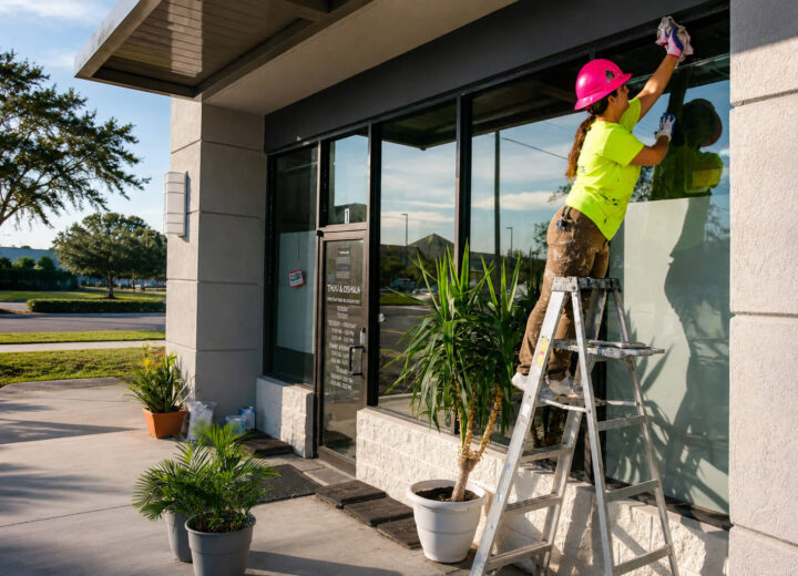
Performance Painting has rebranded 3,489 sites. One example is an exterior repaint for a national grocery chain location in Louisiana, completed around active store hours so operations could continue. On projects like this, the goal is to follow the specified palette consistently from one surface and location to the next. See more of our past projects.
Trend colors can still have a place in areas where brand standards allow more flexibility, such as break rooms, back offices, or amenity spaces.
In industrial space, color is a safety system
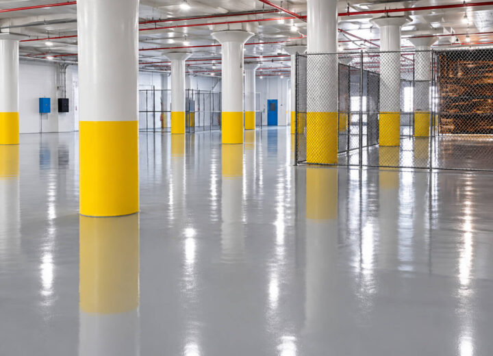
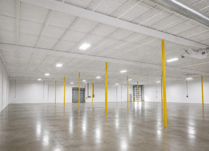
In a plant or warehouse, color carries information. Safety yellow marks physical hazards, red marks fire equipment, and pipe marking follows established standards. Those are not design decisions, and they do not move with the market.
Trend palettes apply only to the office and administrative areas. On the production floor, legibility beats aesthetics, a principle that runs through all of our industrial painting work.
What the color selection process actually looks like
A two-inch chip and a two-hundred-foot corridor are not the same color experience. Warm neutrals shift hard under different light, and a tan that looks refined on the chip can read yellow across a full wall. This is exactly where trend colors go wrong on real buildings.
So we do not hand you a fan deck and wish you luck. For commercial projects, we provide color swatches and can bring in a designer when a project calls for one. Once you are under contract, we produce a digital rendering of your building so you can see the palette on your own elevation before a crew arrives.
One factor outranks color entirely: sheen. A high-traffic corridor in flat paint looks bad in eighteen months, no matter how good the hue is. Match sheen to traffic first, then choose the color.
Frequently asked questions
- What is Sherwin-Williams’ 2026 Color of the Year? Universal Khaki SW 6150, a warm mid-tone tan. Benjamin Moore chose Silhouette AF-655, a deep espresso with charcoal notes. Behr went in another direction with Hidden Gem, a smoky jade blue-green.
- What commercial paint colors are trending in 2026? Warm neutrals, browns, tans, greiges, and other natural tones are prominent in 2026 color forecasts. Some brands are also leaning into richer greens and blue-greens, so there is no single palette every commercial property needs to follow.
- Should a commercial building follow Color of the Year trends? Not automatically. Color of the Year announcements are better used as inspiration than as a specification. Commercial properties also need to consider branding, existing finishes, lighting, traffic, and how the space will look over time.
- Where should trend colors be used in a commercial space? Accent walls, lobbies, conference rooms, reception areas, and other contained spaces can be good places to introduce a more current color. Larger areas such as corridors and offices often benefit from more versatile colors that are easier to coordinate over time.
- How does lighting affect commercial paint colors? Lighting can change how a paint color appears once it is on the wall. Some grays may look cooler or more blue under certain lighting, while warmer neutrals can shift toward yellow or beige. Testing colors in the actual space helps reveal those differences before making a final decision.
- Can I see a color on my building before work starts? Yes. Once under contract, Performance Painting can produce a digital rendering of your building, allowing you to review the proposed palette on your property before painting begins.
Let’s talk about your building
We will walk through your space, assess your lighting, and recommend a palette and finish schedule tailored to how the building is actually used. Every commercial project is overseen by an OSHA-certified job leader.
Explore our commercial painting services or request a quote. Call (904) 641-4800.