Painting walls is one of the most inexpensive and convenient ways to add novelty and interest to a space. An interesting approach to upgrading your interior would be to use an autumn-inspired color palette. If you like the idea of bringing autumn into your space, here is a small guide to modern fall decorating trends.
Marsala for an Elegant Statement
Many interior designers and painters are in favor of autumnal color schemes. Maybe that’s one of the reasons why they chose Marsala as the favorite color for 2015. This red-brown shade fits almost any interior, regardless of the season, and can be combined with many different hues, from cream and peach to mossy green.
Yellow, Like Gold
When it comes to fall painting color palettes, there’s nothing more inviting than golden yellow. Yellow is a beautiful color that brings light within and can be mixed and matched in varied combinations. Depending on how adventurous you are, you can use this color sparingly, add it to one wall or paint an entire room. In addition, yellow allows you to create a truly serene atmosphere, especially when it’s combined with tones of brown, cinnabar or Marsala.
Orange – Stylish or Rustic?
Containing red and yellow, orange is a brilliant shade you can use to wrap your interior in a blanket of warmth. When orange contains more red, it goes well with minimalist interior design; when it has a more intense yellow sub-tone, it provides the best background for rustic interiors. If you’re looking for the perfect symbol of fall, you should go with the beautiful shade of pumpkin.
Paprika, the Ultimate Suggestion for a “Spicy” Decor
Opting for a color scheme that includes paprika is a brilliant idea if you want to add a touch of sophistication to your interior without using traditional colors like red or orange. Combine this color with beige, brown, yellow or olive to carry the autumn theme throughout the entire space. Also, you could complement the casual vibe of your fall painting color scheme with shinny metallics like gold, bronze, brass or copper.
“Plum” Memories
Plum is a wonderful color that reminds us of two things: the elegant sweetness of the fruit and the hue of the autumn sky at dusk. If you paint your interior this color, a great idea would be to sweeten it up by adding cream, beige, light yellow or mint green. Using these shades as accents will help you transform your space for fall, while creating a fun, surprising contrast that will make your interior glow.
A Little Bit of Green
Green is a beautiful color interior designers use to match, contrast and emphasize a variety of fall painting color palettes. A crisp green or an olive shade combined with any fall colors will result in a rich, inviting composition, with a dramatic effect.
If you’re about to choose interior or exterior paint colors, you can definitely rely on the complexity of the fall color palette. From yellow, apricot and caramel to chartreuse, cinnabar, classic browns and olive, the autumn colors have gathered together to bring a breathtaking kaleidoscope to life. Combine these wonderful hues with natural linen, wood and leather, and you’ll end up with the ultimate fall decor, ready to comfort and warm up the soul as winter approaches.
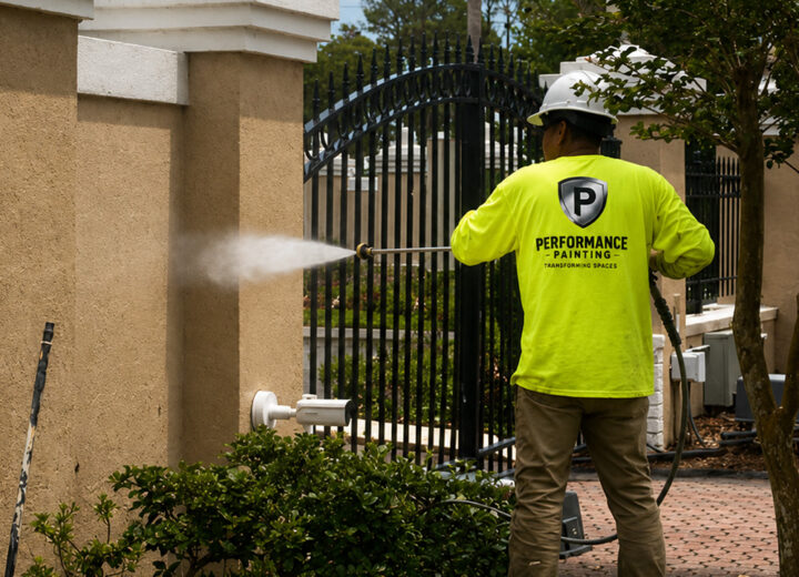
Are you looking for more ideas on how to bring fall into your home or business? At Performance Painting, our experienced professionals are ready not only to walk you through the process of fall painting color selection but also to make your painting experience as easy and trouble free as possible.