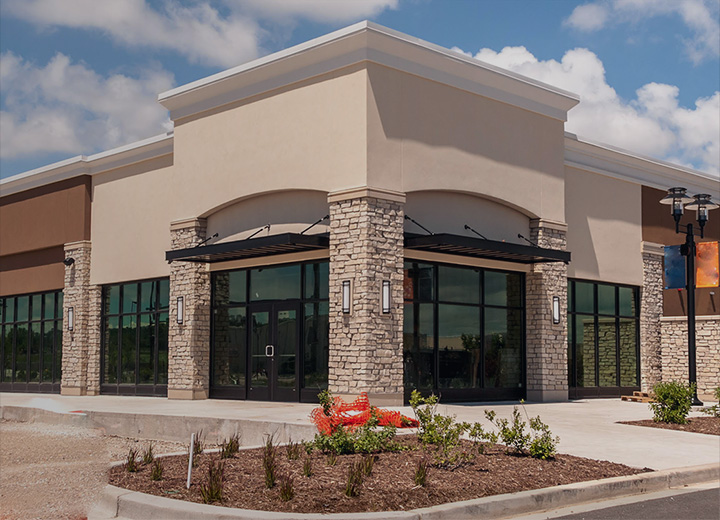
Whether you’re planning to open your first restaurant in Tampa or you’re renovating an existing space, there are many different ways to go about achieving a great interior design effect. Why is interior design important? A pleasant ambiance paired with good food and excellent service is what encourages customers to come back and recommend a restaurant to their friends and colleagues.
The best part is that creating a paint palette for a restaurant is like choosing paint colors for a 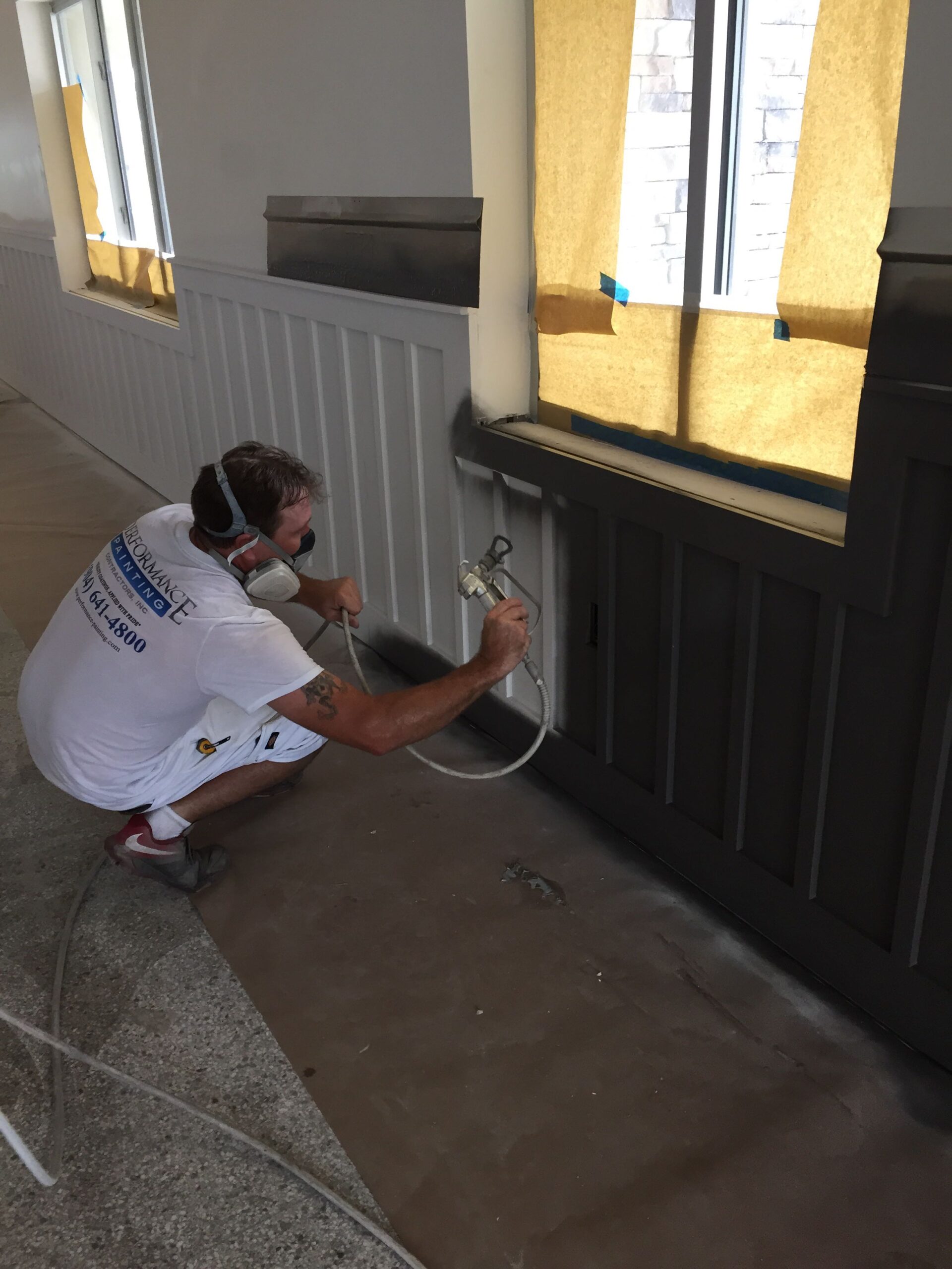 kitchen. Just like a restaurant, a kitchen delivers a great gathering place where people can have conversations while enjoying delicious dishes. With this in mind, the easiest way to select a color palette for your restaurant is to go through the best kitchen colors known to stimulate the appetite, encourage conversation and make people feel comfortable.
Now, instead of talking about the psychological effects of the best kitchen colors, let’s focus on how certain elements in conjunction with different colors can help you make the most of your restaurant design.
Ambiance
Just as with picking the best kitchen colors for a kitchen area, you need to keep in mind the mood you want to create when selecting hues for your Tampa restaurant. Fine dining restaurants, for example, often benefit from soft, natural colors. Our best paint color advice for subduing the frenetic feeling of shades that are too bold and creating a comfortable, slow-paced ambiance is to replace hues like bright beige with soft taupe, deep chocolate brown with medium brown, and strong red with burgundy. A restaurant with a classy look and a soothing atmosphere can encourage customers to relax, enjoy themselves, and possibly stay a little longer for desert and one more drink.
Logo
Opting for one of your logo colors can result in a more unified overall design, with a clear identity. You could also branch out with a beautiful contrasting shade to complete the look. Just to give you an idea, if your logo includes dark sage green and bright orange, you can use a pale tint of olive or peach as the background color. Our Tampa painting contractors also encourage you to get off on the right foot with a statement-making hue. A paint color like cream, taupe, green- or orange-tinted grey is what you need to strike a contrasting note with your logo. This will give your restaurant a touch of sophistication and personality that will better promote its image.
Food
A fast-food restaurant can exhibit strong shades like burnt orange, cherry red and canary yellow. These colors can stimulate impulse eating and encourage customers to move along more quickly. On the other hand, a sit-down casual restaurant should always go for tried-and-true designer takes like toned-down colors. Most health-food restaurants, for example, focus on pleasant earth tones and verdant, fresh greens combined with wood and natural fabrics.
Size and Layout
Depending on the size and layout of the space, you might need to deal with many dark corners. This will affect both the colors and the paint sheen you should use in your restaurant. A common trick that can create the illusion of more space is to select light paint colors and high-gloss finishes. Also, minimalist furniture can offer a sense of visual “lightness” that will lend a spacious appeal to a small restaurant with a low ceiling.
Besides the best kitchen colors you can use in your Tampa restaurant, lighting, furniture pieces, decorative items and serving ware are some other surprising elements of color that can completely transform your restaurant and convey a great dining experience.
If you’re looking to spruce up the curb appeal of your commercial space with an innovative, high-quality paint job that excludes guesswork and annoying do-overs, our Tampa painting contractors are ready to execute your painting project in a timely fashion. Call us now at (813)-308-0388 to speak to our professional paint contractors directly. With Performance Painting Contractors, building customer loyalty is just one paint can away.