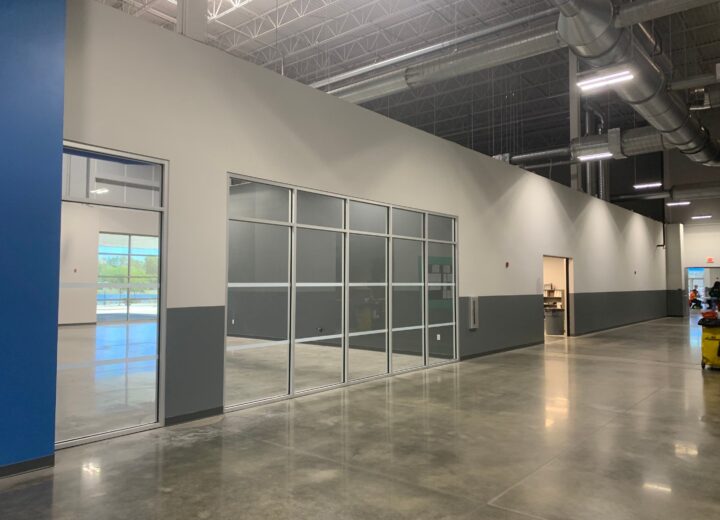
Choosing the right colors for Tampa hotels should go beyond what looks pretty or vibrant. Whether we’re talking about award-winning luxury hotels or small, traditional resorts, management teams need to go for unique color combinations in order to achieve the ultimate feeling of coziness and sophistication.
You could mix and match dark woods, bright polished metals, genuine leather and luxurious fabrics to deliver a variety of layouts. But if you know how to put together cool, calming hues with vibrant, exciting paint colors, you can create a truly distinct, pleasant ambiance for your guests to unwind in.
To make the task of picking paint colors for your hotel easier and more enjoyable, here are the ten most popular paint colors for Tampa hotels.
- Beige – Tampa is a coastal holiday destination. Top hotel executives should never forget this when selecting paint colors for Tampa hotels. A beautiful, soft, natural shade of beige can help you turn your hotel into a work of art that offers a peaceful and restful environment. This is critically important, as a serene ambiance can encourage your guests to relax, enjoy themselves and possibly extend their stay. The best approach to giving a nice edge to your hotel is to start with a light or medium beige and then add a few vivid, eye-catching pops of colors.
- Tinted grey – Regardless of which hue you choose, be it a warm- or a cool-toned grey, the color will be reliable and levelheaded. Because tinted greys transition beautifully with shifting light, they deliver some excellent color alternatives for areas used throughout the day.
- Orange – Warm, earthy tones of orange are experiencing a resurgence, being preferred especially in sit-down restaurants and cafe bars. Combined with dark wood furniture, natural textures, rich accent colors, soft lighting and maybe a fire in a beautiful fireplace, the right shade of orange can evoke a sense of unparalleled comfort and convey an exceptional guest experience.
- Green – Green is a top color choice especially for hotel areas with outdoor seating. This shade is used to emphasize the sense of “freshness,” typically boasted by open-space venues. To make a truly outstanding design statement, you could also add a natural green wall.
- Yellow – A yellow color palette is an excellent option for designing an attractive dining area. A creamy, pale yellow paired with gorgeous, perfectly crafted wood furniture, extravagant art and the right lighting can create a welcoming, stylish yet relaxed atmosphere in your hotel’s restaurant. This will enhance the overall dining experience.
- Turquoise – Turquoise is one of the best accent colors to outline a neutral palette. Imagine using a shade of turquoise that’s reminiscent of the calming Gulf in the lobby; or a soft, light turquoise evoking a sense of serenity and calmness in your guestrooms. Fact is, the hundreds of turquoise shades available today can make Tampa hotels look truly remarkable.
- Dark brown – Dark colors are wonderful picks particularly when matched with pastels like ivory, pale yellow, light blue or lime green. Casual, warm and relaxing without being too “heavy,” dark brown is a good paint color for conquering a classy look and creating an intriguing atmosphere in cafe bars and exclusive cigar lounges.
- Purple – Typically associated with royalty, purple is an extremely beautiful shade, particularly when the paint has a satin finish. Mixing the color eggplant with a pale lavender and light gold is a surefire way to create a refined color scheme with a subtle, soft glow.
- Black – Black is the ultimate color trend for modern Tampa hotels. Perfectly complementing contemporary lines and minimalist interiors, this shade is best to enhance other colors, encourage expression and make a truly artistic statement.
- White – As the most honest, harmonious family of colors, white is a great place to start when picking colors for Tampa hotels. Whites can feel classic, elegant or contemporary. When paired with certain colors, they can create a lively, energetic ambiance or, on the contrary, a calming, serene or dramatic atmosphere. As white can easily complement any architectural style, the right shade of white paint can deliver the perfect backdrop for the hotel life happening around it.
Though there’s really no one-size-fits-all solution for choosing colors for Tampa hotels, it’s very important to select the right hues for each area of your hotel. While public areas can have a livelier decor and vibe, guest rooms should always fulfill the travelers’ desire to relax.
If you’re still unsure of how to create a fabulous color palette that can transform your entire hotel into a better version of itself, feel free to contact us at Performance Painting Contractors. With extensive experience in managing hospitality industry projects, our color consultants and commercial painting contractors can craft the perfect color scheme for your hotel and meet your needs for totally unintrusive, on-time and on-budget hotel painting. For top-quality painting services for guest rooms, restaurants, bars, meeting rooms, banqueting spaces, public areas or the entire hotel, get in touch with our Tampa painting contractors today by calling (813)-308-0388.