Color is a very powerful tool the hospitality industry can use to add emphasis, change perceptions and provide calm, peaceful environments that allow guests to relax in comfort. But one thing any guest will appreciate is having a truly welcoming, relaxing room. Making sure that your guests are getting the tasteful, stylish decor they want and all the rest they need is imperative in order to offer them a great customer experience.
No matter what colors you intend to use in the public areas of your hotel, it’s important that you pay special attention to the color palette for your guestrooms. For this, let’s take a look at how you can apply five no-fail colors to form beautiful spaces and promote better sleep.
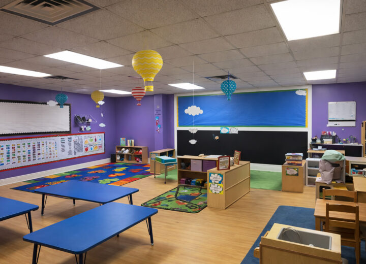
- Muted blue – Reminding us of water and sky, blue is perceived as an important constant in our daily lives. Typically linked to calm, soothing, serene feelings, a room painted in a muted shade of blue can help us relax and fall asleep more quickly. Different studies have also shown that those who sleep in blue rooms wake up feeling happy, positive and energetic. Also, little details like including muted blues across your hotel’s color palette can keep your guests in a good mood all day long. If you think blue doesn’t fit your guestrooms too well, you may consider using it as an accent color on a white, butter yellow or light grey “backdrop.”
- Earth tones – Tranquil, soft and comforting, earth tones deliver some excellent color options for creating a chic, relaxing mood in your guestrooms. A soft tone of beige, a medium taupe or a sweet shade of caramel can make a guestroom transition beautifully into a relaxing, restful, spa-like retreat as the day goes by. Using an earth tone is a wonderful idea not only to promote relaxation and better sleep but also to create refined, cohesive and delightful interiors.
- Light green – Green is another good color for creating a nice balance and giving your guestrooms a better sleep makeover. A cool, pale shade of green can lower blood pressure and heart rate, ensuring a proper night’s sleep. Just like blue, green also makes people feel upbeat and positive when they wake up. If you want to spice up a boring green color palette, the best advice our commercial painting contractors can offer is to leave strong shades like fire-engine red, bright orange or electric blue out of your rooms. These colors can create anxiety and restless sleep. For a vivid yet well-balanced color palette, it’s best to choose complementary colors with a soothing vibe.
- Pale yellow or orange – Doing a great job at stimulating communication and creativity, warm colors are more suited for social areas. But pale shades of yellow and orange have also been found to provide a comfortable, warm and reassuring atmosphere. Encouraging relaxation, a cozy, inviting atmosphere can make people nod off easier and usually contributes to better sleep.
- Light grey – Grey is one of the most intriguing colors you can use to decorate your guestrooms. Depending on its undertone, grey can be a cold or a warm color, and can be successfully combined with almost any other hue to breathe life into any modern or classic room setting. Since the color palette in a guestroom should be geared toward creating a comfortable, intimate setting, opting for a light shade of grey with a warm undertone is the recipe for room design success.
The science of color might be helpful when choosing a color palette for better sleep. However, it’s not an exact science. For this reason, we would like to suggest that you go for a paint color that perfectly fits the overall decor. If your rooms look better dressed up in a light shade of olive, then olive is likely a much better choice than muted blue.
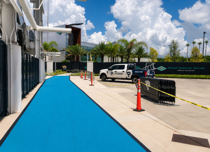
Painting companies aren’t all the same; knowing this can make a huge difference for your hotel. Committed to the local community, Performance Painting Contractors is more than just a typical painting company; it’s a responsible and dependable partner you can count on for a full range of high-quality commercial painting services. With offices located in Jacksonville and Tampa, FL, our color consultants and commercial painters are ready to take on any interior or exterior painting project. If you’d like to learn more about how to use color to enhance the curb appeal of your hotel or if you have any questions about our painting services, please feel free to contact us today!