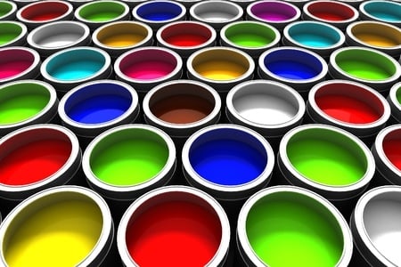
Color can be a powerful tool when it comes to attracting customer attention. While the right colors can make your company stand out in a good way, the wrong color choice can work against you, chasing away your customers.

In this post, we present seven colors that professional Jacksonville painters advise businesses to avoid.
- Magenta: Considered a great color, magenta is actually a bright, fluorescent shade that many people find disturbing. Containing red, pink, and purple, magenta isn’t only very powerful but also too stimulating and distracting, which makes it completely inappropriate for a business trying to attract customers.
- Bright Yellow: According to professional Jacksonville painters, a strong shade of yellow is one of the worst possible colors for a business…even if it sells lemons. Bright yellow paint may capture attention instantly but it also over-stimulates the eye, making people irritable. Since bright yellow is really vibrant and has an overpowering effect on people, it should only be used in small doses, as an accent element, or in softer tints.
- Strong Red: Undoubtedly, red is a vivid, beautiful color. But too much of it can make people feel anxious and angry. Though bright, strong shades of red like cherry red are way too harsh for a business, they can be successfully used as accents to add interest to a space.
- Bright Green: Like many vibrant colors, bright green is a great choice to create an energetic environment. Unfortunately, many people find bright green overwhelming. A color that’s too intense can make people feel restless and impatient, which could be devastating for a business trying to close a deal with a customer.
- Turquoise: Turquoise comes in a wide range of tones and hues, which are beautiful, cheerful, and amazingly versatile. However, professional Jacksonville painters consider turquoise too flashy for a business. And they’re right. While turquoise looks aesthetically appealing and catches people’s eyes, it’s too energetic and intense, causing irritation and nervousness.
- Greige: Greige is a made-up color, obtained by mixing gray and beige. Dull and lifeless, this color shouldn’t be used in areas where a monochromatic effect is required. Instead, it can be combined with other colors, such as grassy green and sunshine yellow, to create an inviting ambiance and bring your business to life. The same theory applies to gray and beige, even though they’re two of the most popular choices for office design.
- White: Neutral and soft, white may seem like a great option for a business. But according to a study conducted by the University of Texas, employees tend to make more errors when they work in white offices. What about your customers? Will white drive them away from your business? The answer is no, as long as you know how to combine white walls with appealing elements or bold accent walls.
A word about pink and violet: very few people find these two colors likeable. While pink is too feminine, violet seems somehow oppressive. To be on the safe side, it’s best to avoid both colors when decorating your business.
Before opting for a color scheme, ask yourself whether it fits your business or not. Too many business owners choose colors that simply don’t suit their products or services. This can lead to conflicts between how customers perceive certain products or services and what a business actually provides. At the end of the day, it’s not about colors per se; it’s all about how people respond to colors.


