Every year, interior designers and decorators come up with new color schemes that can add a touch of sophistication and modernism to any interior or exterior. One thing we’ve observed over the years is that paint color schemes are getting more refined. That’s not only because interior decorators combine hues in a quite unexpected yet fitting way but also because paint manufacturers continue to develop new products, processes and application techniques that push the boundaries of what we think possible.
If you’re planning on giving your Tampa home a “sweet” twist this year, the 2016 color palette is filled with charming assortments of delicate pastels, dark colors and surprising accents. Now, let’s look at the best Tampa real estate paint color options you can use to give your home a brand new look this year.
Energetic Combinations
For a more fashionable, energetic, expressive and cheerful appearance, specialists advise homeowners to pair pastel colors with contrasting hues and bold lines. For example, you could go for a color palette assembling cream, pale olive and a high-chroma color like bright orange. There are at least two Tampa real estate color schemes you can create using these shades: 1) pick cream for your walls, pale olive for the trim and bright orange as the accent color; 2) paint your walls cream and then use pale olive and bright orange to paint a straight line around the perimeter of each wall, alternating the two colors to create a more contrasting, lively appearance. For a more distinctive look, you can replace bright orange with dark green, navy or burgundy.
Comforting Colors
Soft hues derived from neutrals define another wonderful paint color option for Tampa real estate. Instead of going for the same old neutrals like gray or beige, you can choose one of the new neutrals enhanced with a blue, green, yellow, orange, rose or red undertone. Then, you can pair any of these shades with white for a more calming effect or with a warm color like pure tender yellow or soft peach for a soothing, relaxing mood and subtle warmth, so appropriate for a home in Tampa.
Organic Hues
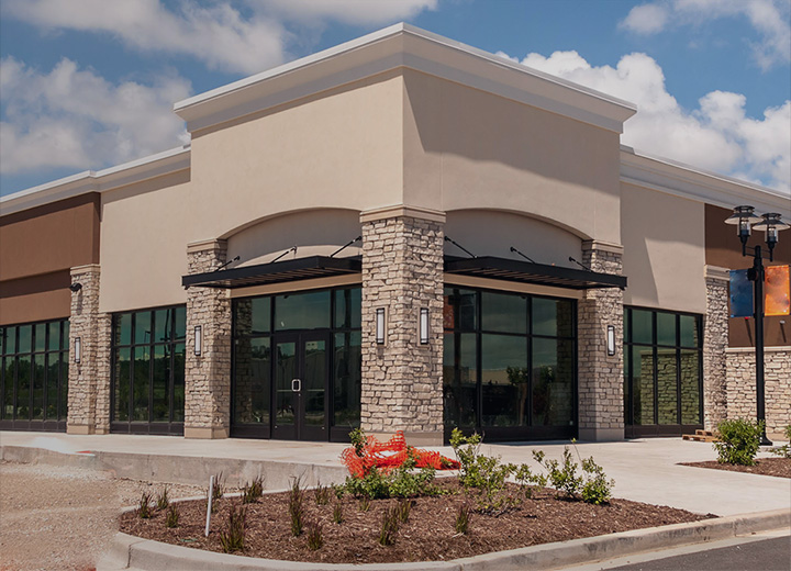
Choosing an earth-tone color palette is a brilliant idea especially if you wish to integrate a piece of Tampa real estate seamlessly in the surrounding coastal landscape. For example, a color scheme that includes certain dominant shades, such as pale pumpkin orange, muted terracotta or rose-tinted cream, can be a great choice for an area in which a warm yet subtle glow is always welcome. Any of these organic colors can be complemented with generous accents of red, intense orange, bold yellow, grass green or chocolate brown.
In addition to these options, dark hues like slate gray, navy, plum and black can put a modern spin on any traditional piece of Tampa real estate.
Whether you intend to sell your property or just want to enhance its appearance, remember that the first thing people see is the color of the house. But this isn’t the only thing to consider when picking a paint color scheme. To avoid striking a discordant note, also take into account the character of the neighborhood and existing Tampa HOA rules.
If you’re looking for a team of experienced and dependable residential painters in Tampa, contact us at Performance Painting. As a leading painting service, we understand how important the appearance of your home is. As a result, our professionals are ready to help you choose the right color palette for your property and deliver a paint job that’s not only in accordance with industry standards but also cost effective.